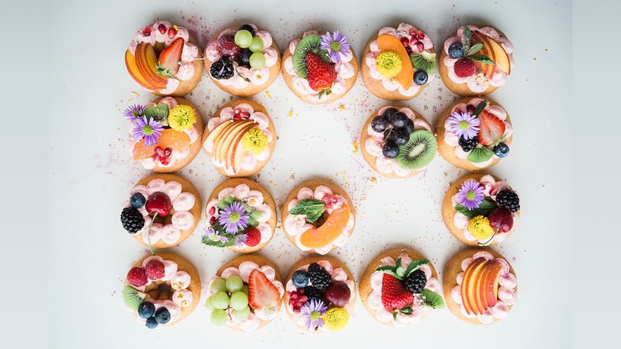
The Comfort Colours Are The Incredible Edibles

The comfort colours that we currently incorrectly call 'neutrals', all have orange as their base. They are the warm whites, beiges, caramels, and browns. We unconsciously use colour to discern good from bad and to keep ourselves safe. Too pale or 'sickly' looking suggests an undercooked batch of baked goods, while too dark looks burnt. If selecting meat or seafood, too grey looks 'off', etc. Colour is an important indicator of whether a certain food is safe to eat.
It is not simply the 'look' that helps us decide to eat or not to eat food of a particular colour, it is also the meaning of the colour for you personally. What memories are triggered? What emotions does that colour stir in you?
In terms of edibility, common foods contain a lot of the warmer ROY end of the spectrum - red, orange and yellow. These are also the most comforting of the hues, making them easy to eat. The Greens we see as the healthiest and most natural food choices. Meanwhile, there are no truly Blue foods in nature. Instead, violet centres are often seen in foods that we call black, such as blackberries and blackcurrants. Grey in food can limit the appetite because it is associate the colour with decay. White is often mixed with yellow to give you that ice-creamy, melt in your mouth moment.

Orange is the combination of the primary colours, red and yellow. These are the base colours of the palette incorrectly labelled as 'neutrals'. Adding white to orange in our baked goods gives us tones from cream puff through to mango custard. Adding grey delivers the shades of beige and caramel that we see in scones, pancakes and croissants. When black is added to orange, we create the deep, rich browns of coffee, whiskey and dark chocolate.
In interior design, the beiges and browns can be considered boring, even though we often associate brown with masculinity and fine foods. We all instinctively respond to colour in a more primal way, even if we are not aware of it. The deeper the comfort colour (ie, when black is added to orange), the more intense the experience. Lighter, whiter, tones suggest a light and fluffy texture. While grey adds balance to the carrot cake and pumpkin pies of the mid tones.
Remember, the true neutrals are black, white and grey. They are not on the visible colour spectrum. The beiges, browns and creams are the comfort colours that we used to call neutrals.


